BHUKU
Design of an end-to-end book inventory application for all
book readers and lovers

ROLE: Research, UX/UI Design, Prototyping, Usability Testing
*This is a student project completed as part of my design portfolio.
Bhuku is an app for book lovers that will help users track every book they own, books they have read, what they will read next, and also everything they have loved so far. In essence, it’s quite similar to goodreads.com.
BACKGROUND
Bhuku wants to stand out from its direct competitor, Goodreads. They need a user-friendly designed app with more user-centric approach to their app, adding features and flows, and a fresh and clean design that will help users keep their online library and reading lists organized, and help users discover new books to read.
THE CHALLENGE
SOLUTION
Determine how avid readers organize and utilize their digital library to design a user-centric app for Bhuku based on readers wants and needs.
EMPATHIZE
Before I started making any design decisions, I needed to:
Identify the target audience of book inventory app users
Learn who the main competitors of Bhuku and their offerings
Uncover what Bhuku can offer to its users that would separate them from their competitors
Find out how people are learning about new books to read
Find out how people are keeping track of their book reading lists and wishlists
I started my research by looking into current data available with the overall book market.
RESEARCH PLAN
Based on my market research findings, the book industry has seen stable growth within the past five years and is expected to continue growing. Overall, digital markets are seeing the most growth, even though eBooks and audiobooks combined only make up 19% of the market.
SECONDARY MARKET RESEARCH
click on image to view in larger scale
After I completed my market research I needed to understand the habits of today’s book readers. I conducted an online survey via Google Forms and had 7 participants, ages ranging from 26 - 75 years old.
Survey Findings
2 of the 7 participants read 3 books in a month
42.9% read with an e-Book
3 out of 7 participants use Goodreads as their book inventory service
5 out 7 participants like to set a yearly reading challenge goal and they enjoy achieving their goal ahead of schedule
that all participants utilize wishlists and to keep track of what they have read
3 out of 7 participants like to see what their friends are reading and what the app is suggesting them to read next
SURVEY
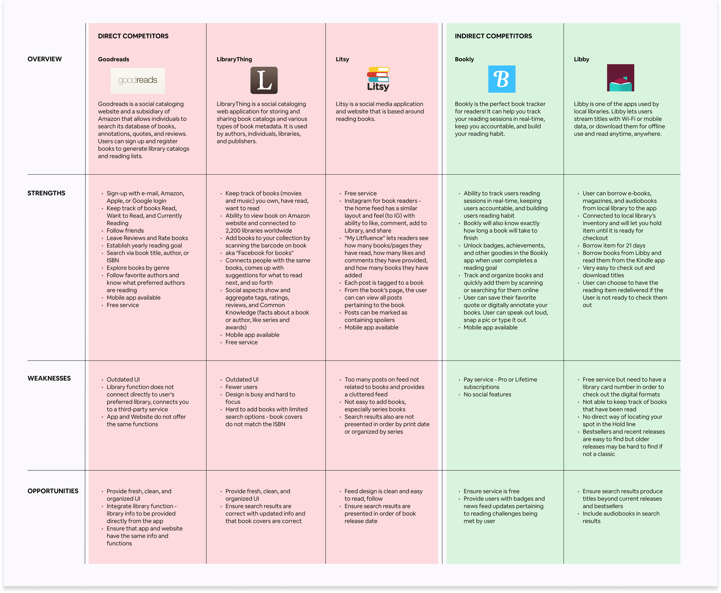
After the Market Research and Survey, I conducted a comparative analysis of apps similar to Bhuku to better understand Bhuku’s target market and its competitors.
I looked at three direct competitors (Goodreads, LibraryThing, and Litsy) and two indirect competitors (Bookly and Libby). Besides downloading the different apps and perusing their websites, I also read reviews left by users on the different apps in the Google Play Store to help me understand current pain points for the different apps.
Completing the comparative analysis helped me discover what opportunities I could bring to Bhuku to make it a comprehensive book inventory app.
COMPARATIVE ANALYSIS
click on image to view in larger scale
DEFINE
In order to make design decisions, I created a Product Roadmap to determine the goals, priority levels, and features for the Bhuku app based on the survey findings to find what avid readers wants and needs are in a book inventory app.
Priority One - Help users keep their reading lists organized
Priority Two - Help users receive new book recommendations
Priority Three - Help users keep track of the reading goals
PRODUCT ROADMAP
click on image to view in larger scale
Below are three different task flows I created that some of my survey takers mentioned they utilize in their reading app.
Task 1: User has just finished reading “The Maid” by Nita Prose and wants to mark it as “Read” in their Bhuku Library
Task 2: User is looking for a new book recommendation which they finds on their feed. User wants to share this book with their book club members too.
Task 3: User wants to check their reading goal and see what other badges they needs to help accomplish their goal.
TASK FLOW
click on image to view in larger scale
For the User Flow, I used Task Flow 1 and expanded it by adding a couple more steps that some of my survey participants mentioned that they do after finishing a book.
The scenario used for the User Flow was:
User has just finished reading, “The Maid” by Nita Prose. User wants to update the finished book to her Library on her Bhuku app. They also wants to write a review and then look for a new book to read.
Besides having the User mark their just finished completed book, the User also came across the decision point if they want a new book to read.
USER FLOW
click on image to view in larger scale
I created sketches of the different screens that users could come across during their Bhuku app journey. I didn’t stick with the user or task flows mentioned above as I wanted to get an idea of what the general screens (ie. Home screen, user’s digital library, generic book page, etc.) would look like. I felt that I needed to sketch the basic screens first in order to build the layers of the user’s experience.
SKETCHES
click on images to view in larger scale
IDEATE
I created Mid-Fidelity Wireframes of all the different screens that I would use for Prototype flows.
MID-FIDELITY WIREFRAMES
click on image to view in larger scale
I created two different prototypes in mobile version which I also used for the Usability Tests. The Prototypes that I created were:
Searching for a Book Using Camera Scan and Adding Book to the Library
Sharing a Book with Friends
PROTOTYPE
click on prototype above
TEST
For the Usability Test, I had 8 participants who all conducted the Test unmoderated and remote via Maze. I shared the test link to participants in my personal network and received anonymous testers through DL’s Discord channel, #usability-tests. The participants had 3 Tasks to complete:
Task 1: Add finished book to your Bhuku library
Task 2: Write a review
Task 3: Recommend a book
USABILITY TEST FINDINGS
Test Objectives and Goals
To test the usability of the mid-fidelity prototype for Bhuku app
To test how easy it is for the user to:
add a finished book to the user’s Bhuku library/bookshelf using the scanner to search the completed book
write a review, and
recommend a book to a friend
To clearly define and identify user’s frustration and pain points while encountering the app
To evaluate the overall usability and flow of the Bhuku app
Test Results
Below are two screenshots taken from different parts of the Usability Test with heatmap to show the different places that the Participants clicked on. These two different screenshots had the highest misclick percentage and lowest usability score.
The first screenshot is from Task #1 (Add Finished Book to Your Bhuku Library), Screen #3 (Camera Scan) and the task was to have the Tester confirm if the scanned book matches the found result. Even with a simple task, it had the highest misclick rate of 75% (as several participants clicked on other places besides Yes) and the lowest Usability score of 60.
click on image to view in larger scale
The second screenshot below is from Task #2 (Write a Review), Screen #3 (Write a Review) also had a high misclick and usability score as the Tester was to click on Write a Review.
This particular screen had the highest misclick rate of 63%, the lowest Usability score of 36, and 2 Testers got lost.
click on image to view in larger scale
Below are some feedback provided from the different Participants during the Usability Testing:
“I like barcode scanner because it gives me the ability to skip manually entering text fields. If there is an option to use one, and the item is easy to scan, then I’ll use it. The flow was really simple to follow!”
“The flow was a little confusing at first because there were many tasks to do, and I didn't know where the buttons were. But if I became a regular user of the app, I could see myself becoming familiar with it. The add icon (+) blended in with the other items, so it could be helpful for users if it was an animated button, or perhaps a contrasting color to be more visible. I use the barcode scanner a lot for the Target app; every time I’m in store, which is a lot.”
“On the book’s page where I can add or favorite, etc. the icons seemed a little tightly clustered. Maybe it seemed that way because the “add” icon was so big as well. That section could use a little more space between.”
“I couldn't complete it as it didn’t seem like anything was clickable on the “write a review” screen. I don’t often write reviews, but it seemed intuitive enough. I wonder if having the check icon (assuming it’s to confirm the review is completed?) at the bottom of the screen after the user goes through all the steps of the form so it follows the direction of the flow would be more of the expectation.”
“I don't know why I had trouble finding the share icon. It’s the same as Instagram which I use every day, but it’s not what I expected for a reading app. The task itself is similar, but for a reading app, I think I would have expected the share icon that is used with the square and an upward arrow. The airplane feels more casual and more of a social media application, and reading feels more serious?”
“This was REALLY easy which i appreciate. Because this is a book app, it would be nice to make a group, aka the book club and you can send recommendations to the group. Usually when I share something in an app, it sends as a text, more so if the person doesn't have the same app.”
Feedback from Usability Test Participants
Takeaways from User Testing
Looking at the provided heatmaps and feedback provided during the user testing, it seems that I am on the right track to creating a user-centric app which was important to Bhuku. I will definitely clean up and work out some of the issues on button placement and spacing for my iterations.
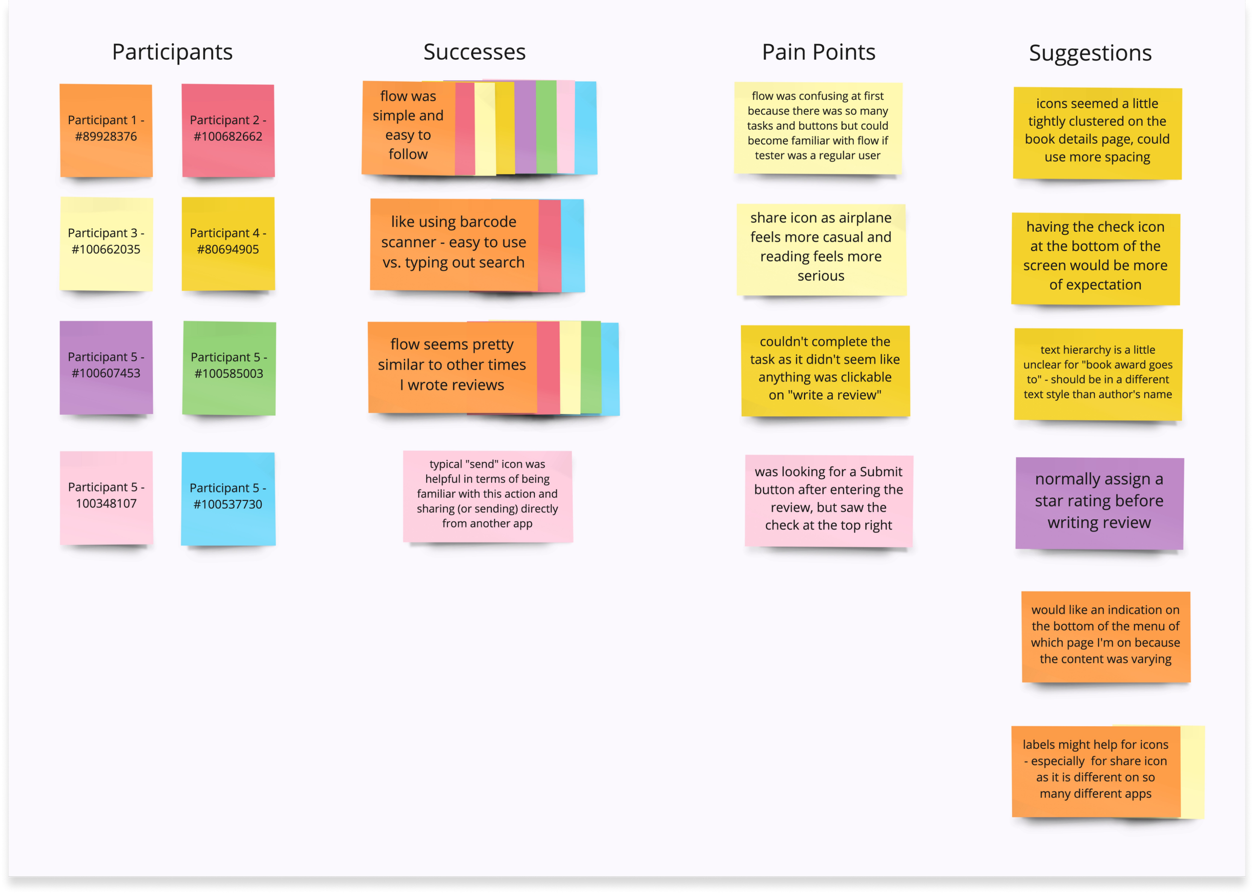
After the Usability Test, I gathered all the provided feedback and placed them into an Affinity Map. I separated the feedback into three different categories - Successes, Pain Points, and Suggestions. The feedback in Suggestions will be used in future iterations of the project.
AFFINITY MAP
click on image to view in larger scale
DESIGN
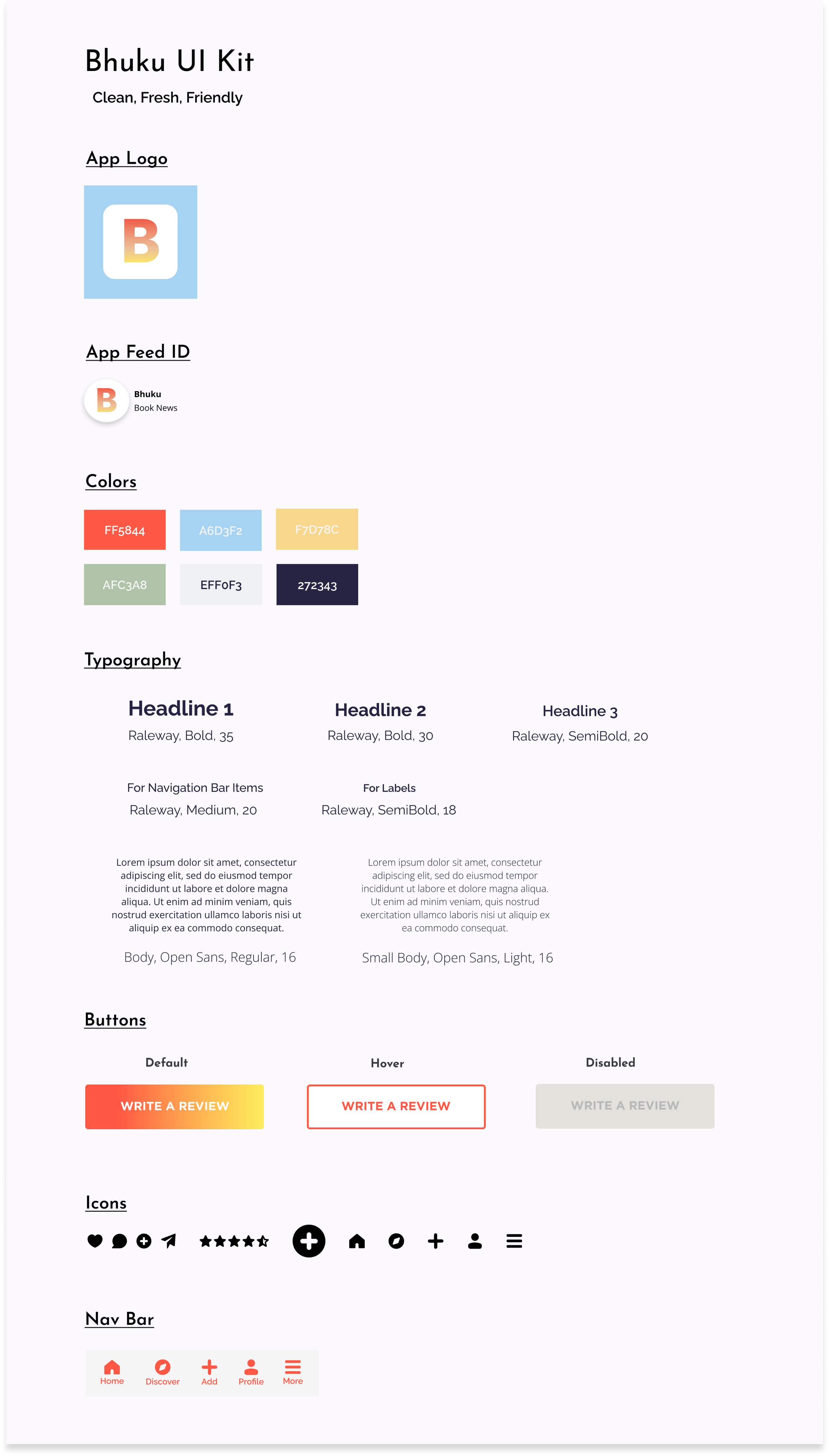
After Testing, I went into the Design phase wanting to give Bhuku a clean, fresh, and friendly look. I created the UI Kit with those three keywords in mind.
UI KIT
click on image to view in larger scale
After the Usability Test, I worked on the Iterations from the provided feedback. I updated the following mid-fidelity wireframes with design elements from the UI Kit to complete the High-Fidelity designs:
News Feed / Home Screen
Book Detail Screen
Book Inventory Screen
ITERATIONS
click on images to view in larger scale
UI DESIGN
click on image to view in larger scale
FINAL HIGH-FIDELITY PROTOTYPE
click on prototype to use Bhuku
In the final high-fidelity prototype for Bhuku, it was important for users to be able to share their recommendations with their friends and be able to keep their reading lists organized. These two prototypes are noted as Goals 1 & 2 from my Product Roadmap.
Prototype 1 ~ Scan - Review - Bookshelf: Flow shows how the user can use the barcode of their book to scan and search for the correct listing. Once the book populates then the user can write a review and also add the book to their bookshelf as Read.
Prototype 2 ~ Book Recommendation: This flow shows how the user can send their friends a book recommendation as an e-mail directly from the app.
As someone who uses goodreads.com on a regular basis it was a lot of fun to work on this Bhuku project. I really enjoyed working on a similar product from start to finish and find ways from the Empathize and Define phases to make it slightly different from the competitor.
For future iterations:
I would like to work on some of the design suggestions left by the Participants from the Usability Test.
I would also like to conduct another Usability Test and show some of the Participants from the original test the final hi-fidelity prototype.
IN CONCLUSION & NEXT STEPS
PERSONAS
Let’s meet our personas, David Fellows and Lisa Mead.
Based on my survey and market research, I found that readers range in all different ages, all read with different mediums, and keep track of books read/want to read in different ways. With such different ranges of readers I found that it would be necessary to create two different personas to best capture Bhuku’s users.
David is retired and has lots of time to read using his Kindle but he still keeps track of the books he is reading via paper list which he often misplaces.
click on image to view in larger scale
Our other persona, Lisa, is an avid reader who enjoys reading physical books but is also open to reading them as an e-book or listening to an audiobook. Lisa uses a book inventory app to keep track of her completed books and reading wishlist but gets annoyed when she reads reviews by reviewers who are not trustworthy.
click on image to view in larger scale


