Mental Health & Mood Tracker App
DEPRESSION & BIPOLAR SUPPORT ALLIANCE, SF
ROLE: Research, UX Design, Prototyping
HACKATHON TEAM MEMBERS:
5 x UX Designers
Regina Drake
Zoe Edington
Taz Mosabber
Neetu Sajan
Grace Shen
1 x Developer
James Boyette
PROJECT TIMELINE:
24 hours in October 2022
BACKGROUND
DBSA’s mission is to provide hope, help, support, and education to people living with mood disorders and their loved ones.
DBSA nationwide offers the largest peer support organization in the US, and serves 3 million.
DBSA participants find:
methods to take charge of their own healing and self-manage their mental health incl. hiring doctors, trackers, groups, etc. and
community support
THE PROBLEM
How might we remove the barrier of cost and access to care, and empower all individuals to self-manage their mental health?
DBSA expressed their desired outcomes:
Users are encouraged to join free DBSA-SF peer support groups to get community and support
Users can self-assess and manage their mental health with easy-to-use digital tools
Dedicated support for underserved people, like LGBT and People Of Color
Users can join from anywhere (not limited to SF Bay Area)
The tech/tools/App should be easy to maintain
EMPATHIZE
RESEARCH PLAN
The team had initially ideated many solutions -- including talking to a professional, a discord style chat, even gamification, but we found that we were overwhelmed and lost in which direction to go. We realized we had to backtrack and remind ourselves of who we were designing for: people seeking mental health help, and also DBSA.
Due to our time constraint, we decided as a team to split up the research needs. We felt it was necessary to:
look into Secondary Market Research regarding mental health and best ways for people to find healing;
conduct a Competitive Analysis on mood trackers/journal apps;
and a heuristic evaluation of the current DBSA website.
SECONDARY MARKET RESEARCH
What we found in our research regarding depression and bipolar disorder -
We did not perform any usability tests due to the time constraints.
DESIGN
UI KIT
DBSA mentioned that it was important for them that the solution be easy to maintain. So one of our first steps before creating any fidelity of designs was establishing a style guide so future developers and designers may streamline edits and other products DBSA may create. Our team won’t be able to work on this product forever -- but we wanted to make sure it works for a long time for anyone seeking to improve their mental health through community.
Another teammate focused on the UI Kit. Their inspiration was to present the app as an inviting and welcoming place, nothing too stark.
click on image to view in larger scale
UI DESIGN
Completing the designs went pretty smoothly as three of us were working together in the Figma file at one-time which was neat to see. I really liked seeing the changes happen quickly. We all had a pretty similar vision and chimed in with questions as we were all working together on a zoom call in the Figma file. Once the designs were complete then I used the Prototype function in Figma to test out the screens.
click on image to view in larger scale
FINAL HIGH-FIDELITY DESIGN
click on prototype above to view the DBSA functions
PRESENTATION & NEXT STEPS
In order to get considered for judging, each team was required to provide a write-up on our app and a 2-minute YouTube video explaining our process - https://youtu.be/VJi_-N3msIk
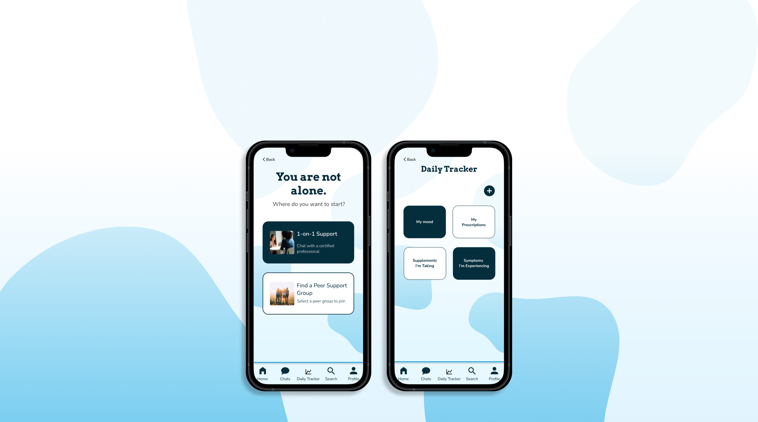
Our solution is a native app that focuses on 3 main values:
Creating a welcoming, anonymous space where users at any stage of their journey can seek support
Leveraging DBSA’s strong sense of community
Digitizing DBSA’s existing resources to make them more accessible and easy to use
We do this through a few key features:
First, users will be able to connect with trained volunteer professionals at any time for on-call support
Second, DBSA’s key service, virtual peer support groups, becomes more convenient, so existing members can find and join any peer group they may need support from
And finally, users can self-manage their mental health through a digitized, easy-access version of the existing DBSA resources.
Our app not only provides support to existing DBSA members, but also serves as a tool to reach new potential members. For example, John may join to track his daily medication, but stay for the virtual peer group. Either way, our app provides support for people with depression and bipolar disorder at any stage of their journey.
ENGINEERING NOTES FROM OUR DEVELOPER
While we didn’t get a chance to progress into the engineering phase, we wanted to highlight some of the anticipated advantages and costs of future development:
The ‘Wellness-Tracker-module’s ‘Calendar’ and ‘Data Visualization’ components will make a significant impact - greatly-increasing a users’ ability to see, access, and assess their progress in an engaged way. At the same time, this module will require periodic maintenance to address evolving usability needs and bug fixes. In order to safe-guard the privacy of user’s medical data, thoughtful architecting of databases and the implementation of encryption “best practices” should be a top priority.
The development of the ‘Chat’ & ‘Calendar’ modules will present an opportunity to pursue either cost-savings (via premade plugins) or increased customizability and data gathering (via an in-house development or contractor).
The ‘User Signup’ module, which has been sign-posted (but not implemented yet) offers significant ‘value-adds’, including increased retention of users, improved user follow-ups (both intentional and automated), and access to insightful and impactful data.
Overall, cloud services are strongly recommended for the hosting of ‘production’, and the warehousing of data, in order to reduce the DBSA’s tech overhead.
LESSONS LEARNED
I was nervous signing up for this hackathon as I did not know anyone on the team personally and was not sure how everything was going to come to fruition.
In the end, this hackathon was such a great experience! I’m sure a lot of it had to do with that I was very lucky to be on a team with many go-getters and who were willing to back each other up. Most of us were either new as UX bootcamp graduates or were in the process of attending bootcamp. We all talked openly about the different processes that we needed to take during the UX process and who could contribute to what. When we finally decided what we wanted to do as a team then it was pretty easy to establish who would have which roles during the design process. It really helped that we were a very communicative group and we kept checking on each other to see where we were with our wireframes, etc.
Considering the short amount of time that we had to research and design our app, I was very proud of our product. If we had more time then I would’ve wanted to tighten up some of our designs but I think for a first go-around we designed something that could possibly be used today. I think something else we should’ve considered (instead of the 1-1 chat support) was creating a function on the app for the support groups to use or creating something that showed when the next support group was so that the member could use the app to sign-up.
click on image to view in larger scale
COMPETITIVE ANALYSIS, CURRENT DBSA WEBSITE, & STAKEHOLDER CONVO
At this phase of the design process, the team did a quick brainstorming session to figure out what we wanted to deliver on the DBSA app.
Based on our research and discussion with the DBSA stakeholders, we found that creating a 1-1 chat function for DBSA members to speak with a trained professional was necessary. This is important for DBSA clients because a crisis does not come on a schedule, and by having trained professionals accessible through their phone, and by being able to talk to peers without waiting for support group meetings, users are able to react with a quick turnaround.
We also wanted to bring the current DBSA Wellness Tracker and Wellness Wheel to life in an app format. Through our research findings, mental health treatment—therapy, medication, self-care—have made recovery a reality for most people experiencing mental illness.
click on image to view in larger scale
USER FLOW
Another team member did a quick user flow once a new user opened the DBSA app. After a quick onboarding to the app, the user could decide at the Home Screen to either seek 1-1 support or use the mood tracker.
click on image to view in larger scale
SKETCHES
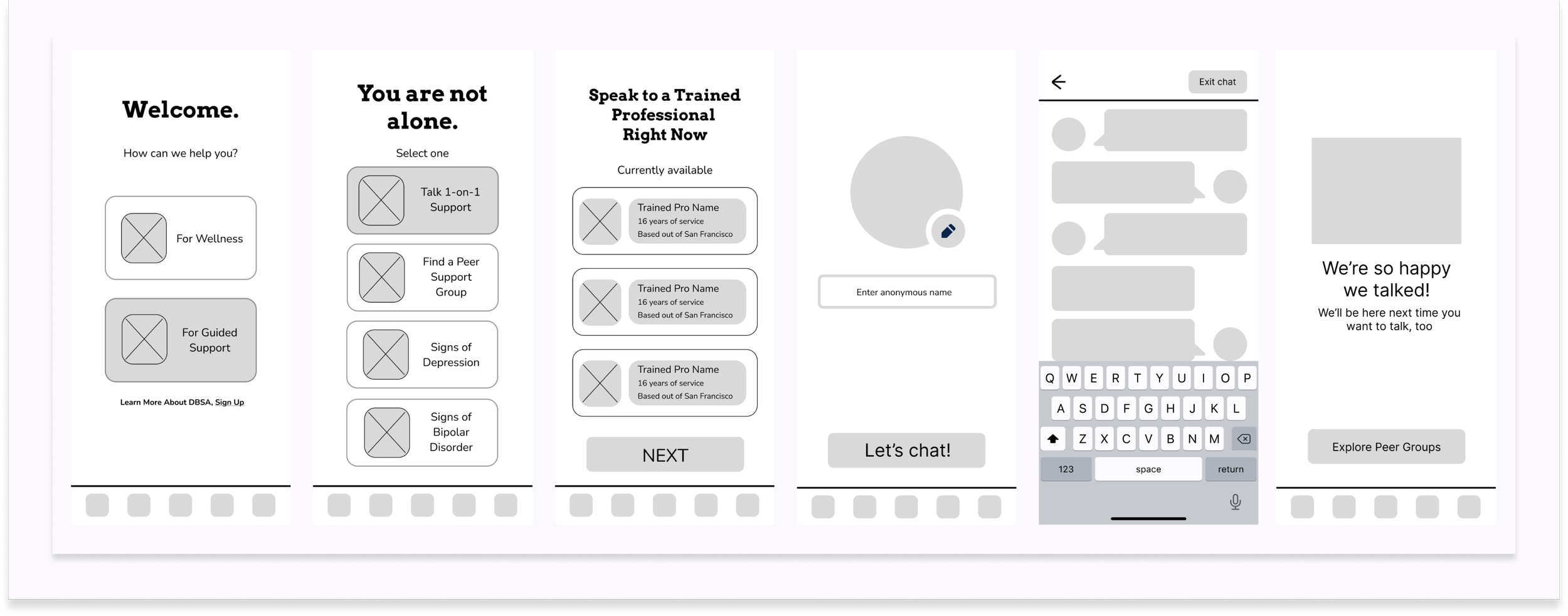
At this point, the UX designers split up into two teams for 1-1 chat function and mood tracker function. I was on the 1-1 chat function team so my other teammate and I took about 15 minutes to quickly create some sketches on how we thought the 1-1 chat function should look based on the user flow.
When my teammate and I shared our sketches, we found them to be similar which made creating the wireframes simple especially with the time constraint. I think my sketches had more text compared to my teammate as they had more icons and visual components.
click on image to view in larger scale
IDEATE
LOW-FIDELITY WIREFRAMES
Below are the low-fidelity wireframes that I worked on with my sketches teammate. I built the first three screens - Welcome, You are not alone, and Speak to a Trained Professional.
click on image to view in larger scale
The other two UX designers put together the low-fidelity wireframes for the Mood Tracker.
click on image to view in larger scale
PROTOTYPE
I used Figma to create a prototype of the 1-1 Chat feature from the low-fidelity wireframes.
click on prototype above
TEST
click on image to view in larger scale
DBSA APP FEATURES
The team member who conducted a quick competitive analysis of the apps Wysa and Breeze, found that while these two competitor apps appear colorful and fun, they did not offer a peer-support component.
Another two team members conducted a heuristic evaluation of DBSA’s current website and defunct app, and academic papers on help-seeking behaviors. They found that the resources DBSA currently offers on their website are:
information on the different support groups offered which you have to email in order to get into a support group,
a wellness tracker and wellness wheel PDF for user to print and utilize on own,
a YouTube video and info on depression or bipolar disorder symptoms.
Our last phase of research was the shortest but most crucial -- we met with our DBSA stakeholders and asked them questions to gain insight on:
who the typical members of DBSA are,
when in their mental health journey do the members turn to DBSA,
how do they find out about DBSA and access their services?
We found out from the stakeholders that:
many of the members are long time DBSA users and some of them are repeat users where they will have used DBSA at one-time, will leave, and then will return again;
all the group sessions are all online and have been since during the pandemic;
and that many of the members are referrals from previous or current members.


